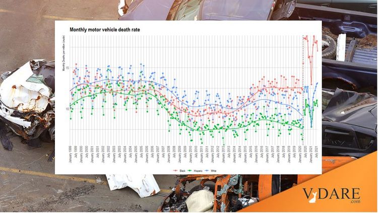
CDC: Monthly Motor Vehicle Death Rates By Race
By Steve Sailer
05/07/2022
Random Critical Analysis has created this graph from CDC cause-of-death monthly data on motor vehicle death rates (per person, not per miles driven) from January 1999 to July 2021. Black death rates are in red, white in blue, Hispanic in green. Unlike FBI crime rates, the CDC, working from death certificates, does a reasonable job distinguishing whites and Hispanics.
For blacks (red) you can see the Ferguson Effect after BLM arose in later 2014, when blacks retook the lead from whites in driving death rate, and then the spectacular Floyd Effect of May 25, 2020 onward, when the Establishment announced that The Science proves you can’t get COVID as long as you feel angry about George Floyd while you party.
Interestingly, you can see the Housing Bubble burst in the Hispanic (green) line around 2008 as the worst Hispanic drivers lost their construction jobs and returned to Mexico.

