

01/01/2011
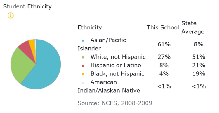
Newsweek isn’t interested in giving its "Challenge" awards to "selective" high schools, (where the gifted students are)but only in high schools that can take poor students and make them better.[America’s Best High Schools: The Elites |Why the nation’s most selective schools fall outside the NEWSWEEK list.] As example of a selective high school, they mention the Bronx High School Of Science, which has a "richly talented, ethnically diverse" student body — here is an actual chart of that:
Student Ethnicity
 |
|
You notice that you have to look at the key to see that Asians are represented by blue, et cetera. A more intuitive chart,using the same color palette, would look like this

The 4 percent black population is maroon, Hispanics in green, the rest is self- explanatory. The charts are produced automatically by the Greatschools computer. The first one has the URL https://www.greatschools.org/chart/pie.page?p=61_27_8_4_%3C1 I rearranged it to https://www.greatschools.org/chart/pie.page?p=%3C1_8_4_61_27 This final chart, based on the exact same figures, is one I made myself, with MS Paint(the red streak is a little iffy, because it’s so thin):

Given that the categories are:
do you need a legend to tell you which color represents which? No, I didn’t think so. So why is GreatSchools.net messing around with green and blue?