
03/09/2014
This chart is featured in Steve Sailer’s post about the SATs below. Note the color legend — blacks in black, Asians in yellow, native Americans in red, Hispanics in brown. The only one that isn’t intuitive is the light blue for whites; white lines would, of course, be invisible against the background.
The chart is not from an official source or from powerful, influential members of the media. It’s from a blogger called "nooffensebut" at the Unsilenced Science. [Black Suits, Gowns, & Skin: SAT Scores by Income, Education, & RaceOctober 24, 2013] He’s anonymous, but his chart is better in this respect than either charts from Forbes magazine, where Peter Brimelow, who worked there for sixteen years, reports that "the Art Department, who were of course mostly lumpen liberals like everyone is in the media world, the kind of people that you find living in Greenwich Village where Forbes offices were located, they would never allow us to have a bar chart with blacks black, Asians yellow, and whites, you know, white! They insisted that blacks had to be green! And Asians had to be blue! And all kinds of other colors."
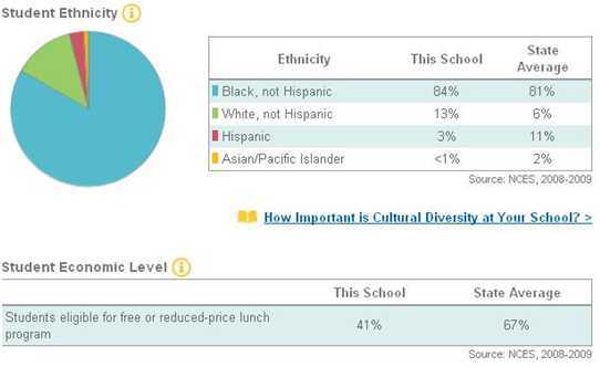
This, for comparison, is a typical chart from GreatSchools on student ethnicity:

The turquoise color represents whatever ethnicity is largest in the school, it’s automatic. A Seattle school which was 84 percent white and 13 percent Asian would look exactly the same. So well done, Unsilenced Science. You're doing better than the MSM and the Federal Government.
This is a content archive of VDARE.com, which Letitia James forced off of the Internet using lawfare.