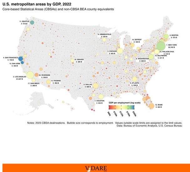
GDP Map of the USA
By Steve Sailer
04/21/2024
On Reddit, somebody named eivarXlithuania has posted his map of “U.S. metropolitan areas by GDP (2022).” The size of the circles equals the number of jobs in each metropolitan statistical area (e.g., Los Angeles includes Orange County but not Ventura, Riverside or San Bernardino counties).
The color equals the per capita GDP per worker. In general, the bigger the metro area, the higher the GDP per capita.
So the richest larger metro areas per capita appear to be (judging by color of their dot):
1. San Jose
1. San Francisco
3. Seattle
4. New York
5. Boston
6. D.C.
The richest per capita mid to smallish metros are in the oil-rich Permian Basin near the Texas-New Mexico border, such as Midland TX, maybe some tiny dots in North Dakota’s oil fields, a few tiny blue fracking dots near the West Virginia-Pennsylvania-Ohio border, Napa, Princeton, or maybe Bucks County, Boulder, and a couple of old money places in Connecticut.
You can explode the map to a huge scale and look at a lot of tiny MSAs, a few of which are quite wealthy but tend to be microscopically small.
No doubt some wealthy small MSAs in between huge metro areas are covered up by big dots. Princeton, NJ, for instance, appears covered by the NYC and Philadelphia disks.

