

By Steve Sailer
10/27/2023
The Roman Catholic Los Angeles Cathedral alongside the 101 (Hollywood) Freeway in downtown Los Angeles, which opened in 2002, is one of the less controversial buildings of the 21st Century: nobody seems to like its exterior much. (The interior is rather soothing.)

It’s kind of stoop-shouldered, as uplifting as a photo of Senator Fetterman.
On the other hand, to its credit it was built remarkably quickly for turn-of-the-century California: the 1994 Northridge earthquake damaged the already obsolete 1876 L.A. Cathedral. Fundraising took four years and construction took four more.
By California standards, that’s incredibly fast.
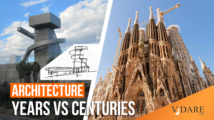
In contrast, European cathedrals typically take centuries to finish. Even the most beloved piece of high aesthetic architecture of recent generations, Barcelona’s church of the Sacred Family, designed by Gaudi and currently paid for by an immense number of tourists chipping in $20 bucks to have a look around, has been under construction since 1882. The plan is to wrap it up by the 100th anniversary of Gaudi’s death in 2026. But we’ll see if that happens.
But what really makes the Los Angeles Cathedral memorable is the public high school that was soon after built across the Hollywood Freeway from it:
The high school has undergone many different names: #9, Ramon Cortines (before the school superintendent was Me-Tooed in some gay sex scandal), and, lately, Grand Arts Visual and Performing Arts school.
But it’s probably the funniest building in America’s funniest city. I call it The Japanese Robot from Outer Space Trying to Burn Down the Cathedral with Its Flamethrower high school:
Unlike the meh Cathedral, the hilariously terrible high school has numerous defenders. For example, its designers, architectural firm Coop Himmelb(l)au of Vienna (note the characteristically 1990s post-modern spelling of their name with its gratuitous parentheses), explains:
The orthogonal layout of the four classroom buildings gains additional spatial tension through the placement of the library building, the lobby and the theater tower — each acting like pieces on a chessboard. These three structures supplement the programs of the school by adding a pubic [sic] dimension to it, thus transforming the dynamics of the campus and creating new relationships to the city, both programmatically and physically.
The urban design strategy is based on the game of chess: a metaphor for a city in which buildings act as “agents” charged with “moves”, and have the potential to transform the urban landscape.
Well, sure…
Coop Himmelb(l)au proudly presents this illustration of its conception:

After all, what’s more authentic than an architecture firm that can’t draw?
Note that the upper half of the high school is entirely decorative, an empty superstructure. And the lower half is lacking windows.