

By Steve Sailer
09/12/2015

To disprove “scare headlines” about a rise in crime following the Ferguson agitation (which started 8/9/2014), the good folks at ESPN’s FiveThirtyEight have assembled homicide data for 59 of the 60 biggest cities in the country for 1/1/2014 through 8/8/2014 and for 1/1/2015 through 8/8/2015:
Scare Headlines Exaggerated The U.S. Crime WaveA full list of the top 60 cities gives a more nuanced picture.
By CARL BIALIK
… The wave of crime-wave reporting began this spring with NPR, CNN, the BBC and USA Today, based on just a handful of cities. In August, after the Major Cities Chiefs Association (MCCA) announced results of a survey of a few dozen of its members about crime in their cities, many other outlets — including Reuters, Voice of America and Time — added to the chorus. And last week, The New York Times put the crime wave on its front page, saying that “cities across the nation are seeing a startling rise in murders.” The Times article was accompanied by a chart showing crime trends in 10 cities, which in turn provoked refutations from The Washington Post and the Marshall Project, based on fewer than 20 cities each.
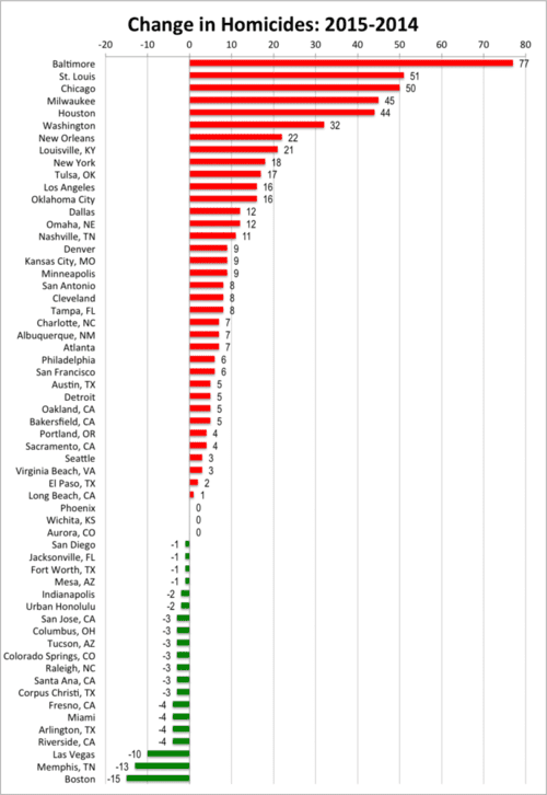
I’ve taken FiveThirtyEight’s table of data and created the graph above, with cities that have seen an increase in homicide numbers in red and cities that have seen a decrease in green.
It looks like the “scare headlines” were right.
There’s always a lot of randomness in homicide stats, but consider this: the biggest decline in absolute number of homicides was in Boston, with 15 fewer dead bodies so far in 2015 than in the same time period in 2014. In contrast, among the cities with increases in homicide, a dozen cities have gone up more dead bodies than Boston went down (with Baltimore leading the way with 77 more homicides).
How about cities with changes, up or down, of at least 5 homicides? Three cities had declines of that magnitude or greater, 30 had increases.
Summing across all 59 cities, homicides were up 16%. That’s a scary 482 more dead bodies so far in 2015 v. 2014.
And as this graph shows, the trend is pretty widespread, especially in the blacker cities.
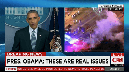
You could argue that the trend wouldn’t be quite so obvious if you left out the top two increases in homicides: Baltimore (Freddy Gray) and St. Louis (Michael Brown). But, of course, that just increases the evidence that this homicide wave is related to the campaign by Eric Holder and friends against the police.
#BlackLivesMatter = #BlackDeathsDon’tMatter
So how big is this change in homicides? The FiveThirtyEight guys go on at some length about statistical significance in each city, but here’s a neat example over almost exactly the same time period that helps you get a better feel for how confident you can be: according to the National Golf Foundation, the number of rounds of golf played in the first 7 months of 2015 is up 0.4% versus the first 7 months of 2014.
Does that mean the Golf Recession is finally over after a decade and a half?
Eh, hard to say. If you look at individual markets, you can see that many are up and many are down. A lot of golf rounds played statistics depend upon the weather, which the NGF report includes to help you interpret whether trends are climatic flukes or not. So far this year, the best market for golf has been the Twin Cities in Minnesota, which are up 14%, while the worst is Houston, down 13% (maybe due to oil prices being down?).
Milwaukee, which has had a 76% increase in homicides, is also up 10% in terms of rounds of golf. Perhaps nice weather is to blame for both?
My guess would be that homicides are more statistically volatile than rounds of golf because they are so few in number in many places. If Arlington, Texas is down from 8 murders in the first 7.25 months of 2014 to 4 in the same time period in 2015, well, randomness is probably playing a big role.
But, still … this graph suggests that our society insisting that blacks should be angry at law & order has led to more blacks killing each other in substantially black cities. No doubt that’s not the only reason for what we see on this graph, but it sure looks like the most obvious reason.
Hopefully, this trend won’t continue. People sometimes learn from past mistakes. In the mid-1990s, for example, a lot of people figured out that the trigger-happy crack-dealer lifestyle that seemed so glamorous on their gangsta rap albums wasn’t a good idea at all.
P.S. More on this topic here.