

By Steve Sailer
09/13/2015

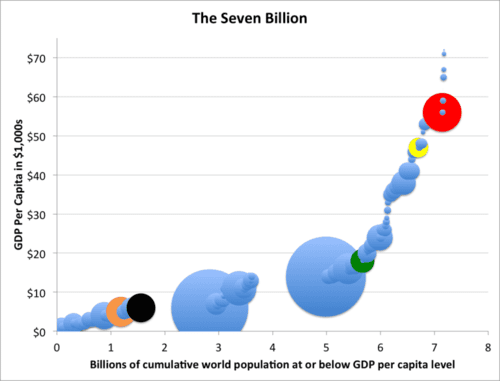
Here’s a graph I’ve created based on International Monetary Fund estimates for 2015 that shows that almost seven billion people live in countries with lower per capita GDPs than the $56,000 of the US (red disk), most of them much lower.
On the vertical axis is GDP per capita, while on the horizontal axis is the cumulative world population at that GDP level or lower. Each country’s population is proportional to the area of its disk. The two huge blue disks are of course India at $6k and China at $14k. The USA is red, Germany is yellow, Mexico (which is richer than countries accounting for 5.5 billion people) is green, Nigeria black, and Pakistan beige.
The IMF doesn’t break out data for Puerto Rico, but it would fall on this graph between Mexico and Germany. One estimate of its per capita GDP is $29,529, while another is $34,938 (due to massive subsidies since the 1950s intended to persuade Puerto Ricans to stay home). In either case, over six billion people live in countries with lower per capita GDP’s than Puerto Rico. Yet, somewhere around 5/8ths to 2/3rds of all Puerto Ricans now live in the Fifty States.
By the way, Qatar, host of the 2022 World Cup, is literally off the chart at $144k per capita GDP.