

By Steve Sailer
05/25/2020
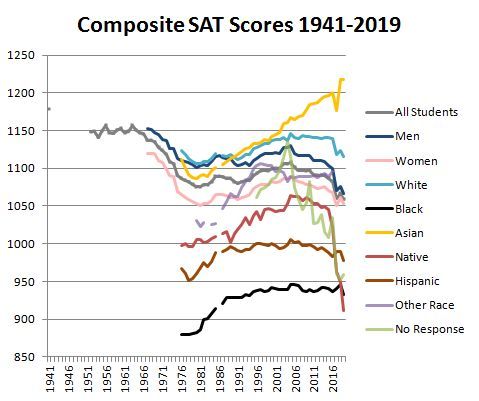
I don’t know if this #SAT chart is accurate.
But let’s assume it is.
The depiction of data shows strong confirmation bias.
Look closely at the lines.
Male students: BLUE line
Females: PINK
Asians: YELLOW
Blacks: BLACK
Native: RED
Hispanic: BROWNPre-conceived ideas matter. https://t.co/YKDZfhaofo
— Lynnette KhalfaniCox (@themoneycoach) May 24, 2020
Students taking the SAT felt Stereotype Threat mindrays from the future emanating from @UnsilencedSci’s upcoming decision to graph SAT average score trends by race using easily comprehensible line colors (e.g., black for blacks, yellow for Asians, etc.) and thus scored high or low.
It’s Science.