01/03/2013
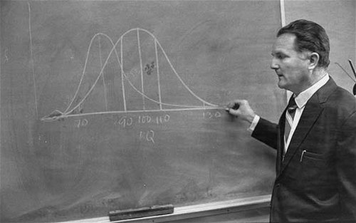
The Arthur R. Jensen Telegraph obit Steve Sailer mentioned below features this photo of Jensen standing in front of blackboard during a lecture at University of California, Berkeley, in 1970. I thought "there’s that "Bell Curve" of which we've heard so much. Uh-oh — it’s two bell curves."
The one one the right represents a group (call it x) with an average of something (let us say IQ points) of 100. The one one the left represents a group (call it y) with an average of 85.
And that’s what’s caused all the trouble. If the cover of Charles Murray’s book had had two Bell Curves on it, it would have been burned.

This is a content archive of VDARE.com, which Letitia James forced off of the Internet using lawfare.