

05/23/2021
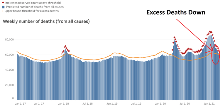
Here’s the CDC’s graph of weekly total deaths from any and all causes up through March 13, 2021 with the eight most recent weeks left off due to incomplete data. These are not Covid deaths, but every and all kinds of deaths: cancer, car accidents, rattlesnake bites, whatever. So, while I’m sure debates about dying-with-Covid vs. dying-from-Covid are fascinating, they aren’t relevant here. This graph shows just plain deaths.
The orange line is the “upper bound threshold for excess deaths.” They look at long patterns and trends and predict how many deaths there would be each week. I’m guessing that’s the 95th percentile level for a normal year.
As you can see, there were a lot of excess deaths in 2020 and early 2021. It wasn’t the Black Death, but it wasn’t nothing either. The excess deaths of January 2018 are what “It’s just the flu, bro” looks like. From late March 2020 to early March 2021, however, was something else. These excess deaths just happened to come in three waves exactly in the same states and same times (just lagged by a number of weeks) as the three waves of coronavirus cases.
As I’ve been saying for a very long time, the novel coronavirus is neither the end of the world nor nothing. It’s a sizable problem.
I cut off from the right edge of this graph the eight most recent weeks of deaths because the CDC says it takes up to eight weeks for death reports to trickle in. This makes the eight most recent weeks of the current graph misleading because all throughout the pandemic, it has always looked like the pandemic has suddenly, Hallelujah!, died out over the last month. But then you come back a month later and it looks like “Oh, a month ago was pretty lethal after all. But, at least, the latest month is great. Woo-hoo! It’s over!” Rinse and repeat month after grim month.
Somebody who really cared could estimate the final tallies for the latest eight weeks by building a model from looking at old data, but that’s too much work for me.
So the last week in this graph I’m showing you is nine weeks ago, the week ending March 13, 2021, the most recent week for which we can be pretty sure the total number of deaths on the graph is quite close to 100% of actual deaths.
And, finally, that week ending March 13, 2021 is the first week since March 21, 2020 in which total deaths do not exceed the upper threshold of expected deaths based on long-term patterns.
It’s about time.
(There have been practically zero flu deaths in 2021 so far, which has helped.)
An interesting question is whether total deaths will fall below the long-term trend line as the pandemic recedes, assuming it continues to recede (but stranger things have happened over the last 17 months, so the current optimistic trend could change).
As you can see, the pandemic killed a whole bunch of people, some of whom likely didn’t have long to live anyway. It could be that total deaths will therefore drop below average in the near future due to the people who would die then having already died due to the virus.
Or it could be that deaths were well distributed among people with, say, 20 years expected life so that this clearing-the-underbrush effect will be insignificant. Or it could well be that Covid has nasty long term effects on a non-trivial number of current survivors, who will die of long term effects.
Or, perhaps, everybody will drop dead from the vaccine.
We shall see.
This is a novel situation, so it’s hard to make confidence-inducing predictions.