

04/25/2023
Earlier: Why Are Americans Dying So Young? It’s “Deaths Of Exuberance”
My discovery a couple of years ago of how Deaths of Exuberance (murders and car crashes) respond to headline events like Ferguson and Floyd would seem like the most important in the social sciences since Case and Deaton’s discovery of Deaths of Despair in 2015.
On the other hand, it remains one of the better kept secrets of the decade, probably for multiple reasons. Mentioning it in the media makes America’s sacred cows look less sacred, it makes The Establishment look less competent, and the discoverer is a Crime Thinker and if he’s right about such an important question, what else might he be right about?
The best I can come up with is to just keep working on displaying the data ever more self-evidently.
What are the best ways to show graphically how post–George Floyd depolicing contributed to the ongoing surge in homicides and traffic fatalities?

This graph shows the cumulative number of blacks who died by homicide for each of the 52 weeks of the year. Black homicide deaths were lowest in 2018, the blue line at the bottom, then slightly higher in 2019 (green line).
In 2020 (the crucial red line), homicides were running slightly higher again in the first 11 weeks of the year before COVID became a big deal. The homicide rate worsened a little over the next ten weeks of lockdowns, then kinked sharply upward after George Floyd’s death.
2021 (black line) was very similar to 2020 after George Floyd. In other words, 2021 was just a continuation of 2020’s high plateau of black murders with the exception of a period of lower murders in 2021 before May 25, as there was in 2020.
2022 (gray line) started off as bad as 2021, but eased off over the summer. But the cumulative figure was still somewhat worse than in 2020, when the CDC’s death data runs on at the end of September 2022. (The CDC imposes a 6-month lag on death from “external causes” data in case investigators change their mind from say, car crash to suicide to homicide.)
The black motor-vehicle accident death figures are perhaps even more obvious:

The 2018 and 2019 curves are hard to distinguish because they are right on top of each other.
The red 2020 line was running just above the previous years during the winter and during the COVID lockdowns. Since less miles were being driven in March through May, that suggests bad driving among those out on the roads. But the big kink in the graph is in the weeks after George Floyd’s demise, during the nation-wide Mostly Peaceful Protests when the cops retreated and stopped pulling over bad drivers so much for fear of becoming the next Face of White Supremacy.
2021 (black line) continued the pace of the last seven months of 2020.
The gray 2022 started out as bad as 2021 but then eased off considerably in Q2 and Q3, and by the end of September was down to the 2020 level of deaths, but still far above 2018-19.
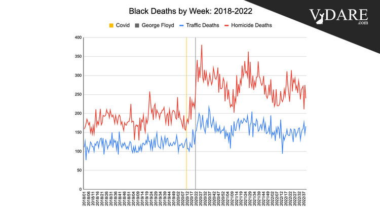
I also can plot deaths by month going back to 1999 (but only by week since the beginning of 2018):

This has the advantage of putting the 2020s in a much longer historical perspective. Wow, 2020 is crazy compared to the usual changes from year to year. A downside is that nobody without a microscope can discern the difference between COVID and George Floyd.
And I can do the last 5 years by week, as I showed you yesterday:
