

05/17/2020
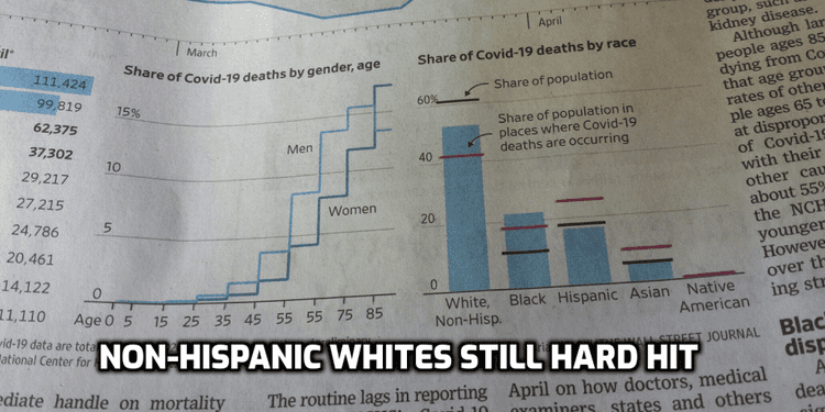
I just got around to reading the weekend paper edition of WSJ. It has a very good explanation of the numbers and a great chart showing deaths by race and ethnicity.
They show deaths by share of US population and deaths by share of population where the deaths are occurring. The latter is what the CDC uses. Either way, Hispanics, Asians and Native Americans are not being hit as hard as non-Hispanic whites and blacks.
This is what it looks like in my paper copy:

Also, there is a good discussion of age groups affected.
The article itself is behind the WSJ paywall:
In mid-April, 30% more Americans died than was typical in the same period in previous years, a Wall Street Journal examination of federal death certificate data shows. Yet the coronavirus’s precise toll still isn’t very clear. https://t.co/an1xHvcau7
— The Wall Street Journal (@WSJ) May 15, 2020
But this chart is available online:

Earlier: